
Hi, In this post we will see how to get started with CKEditor in Angular6
ng2-ckeditor:
I decided to make use of ng2-ckeditor because of the community support and number of download in nuget packages
We can download it from ng2-ckeditor.
Steps:
- Add ng2-ckeditor to package.json file “ng2-ckeditor”: “^1.2.2”, under dependencies section
-
Now include ckeditor related js file in the head section of index.html
<script src="https://cdn.ckeditor.com/4.5.11/full/ckeditor.js"></script> -
Include CKEditor Module in the main module where you are planning to use
import { CKEditorModule } from 'ng2-ckeditor'; @NgModule({ imports: [ //...... CKEditorModule ], declarations: [//.....], bootstrap: [ //....... ] }) export class YourModule { } -
Using it in the component
your.component.ts import { Component, OnInit } from '@angular/core'; @Component({ selector: 'app-your-selector', templateUrl: './your.component.html' }) export class AdminDashboardComponent implements OnInit { constructor() { } ngOnInit() { ckeditorContent: string = '<p>This is Pavan Kumar Aryasomayajulu</p>'; } } -
Including ckeditor in template file
             <ckeditor
                 [(ngModel)]="ckeditorContent"
                 [config]="{uiColor: '#99000'}"
                 [readonly]="false"
                 (change)="onChange($event)"
                 (editorChange)="onEditorChange($event)" <!-- CKEditor change event -->
                 (ready)="onReady($event)"
                 (focus)="onFocus($event)"
                 (blur)="onBlur($event)"
                 (contentDom)="onContentDom($event)"
                 (fileUploadRequest)="onFileUploadRequest($event)"
                 (fileUploadResponse)="onFileUploadResponse($event)"
                 (paste)="onPaste($event)"
                 (drop)="onDrop($event)"
                 debounce="500">
             </ckeditor>
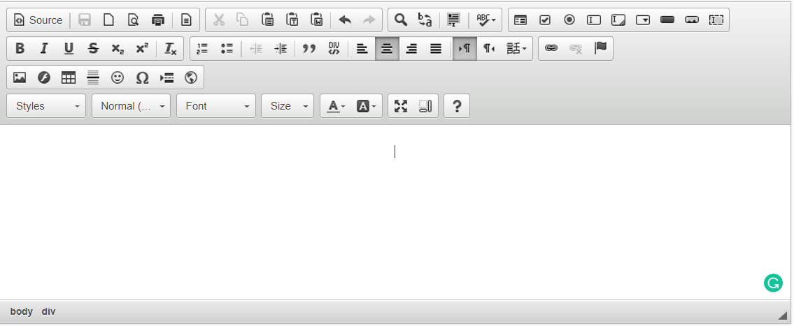
This is how our editor looks like
Configuring CKEditor
CKEditor is a powerful tool and it provides a lot of flexibility to end user to configure it. lets see some basic configurations
– your.component.html
<ckeditor [config]="config" ></ckeditor>
– your.component.ts
	import { Component, OnInit } from '@angular/core';

	 @Component({
		 selector: 'app-your-selector',
		 templateUrl: './your.component.html'
	 })

	 export class AdminDashboardComponent implements OnInit {
			 config: any;
			 constructor() {
				this.config = {
				  uiColor: '#CCEAEE', // This is to set editor color https://ckeditor.com/docs/ckeditor4/latest/examples/uicolor.html
				  toolbarGroups: [ // Configure Different elements present in Editor
					{ name: 'clipboard', groups: ['clipboard', 'undo'] },
					{ name: 'editing', groups: ['find', 'selection', 'spellchecker'] },
					{ name: 'links' },
					{ name: 'insert' },
					{ name: 'document', groups: ['mode', 'document', 'doctools'] },
					{ name: 'basicstyles', groups: ['basicstyles', 'cleanup'] },
					{ name: 'paragraph', groups: ['list', 'indent', 'blocks', 'align'] },
					{ name: 'styles' },
					{ name: 'colors' }
				  ],
				  resize_enabled: false,
				  height: 500 // Setting height
				};
			 }

			 ngOnInit() {
			 }
	 }
So basically for ckeditor component we are passing configuration using [config]=”config”.
If we see configurations, uiColor is used to define the color of the editor this can be used to match your company theme color
toolbarGroup is basically an array of objects used to configure different items in the editor toolbar and we can add or remove them based on our requirement. Each object in the array has a name and groups which is again an array containing different sections. We can also add these sections to other groups too.
For example:
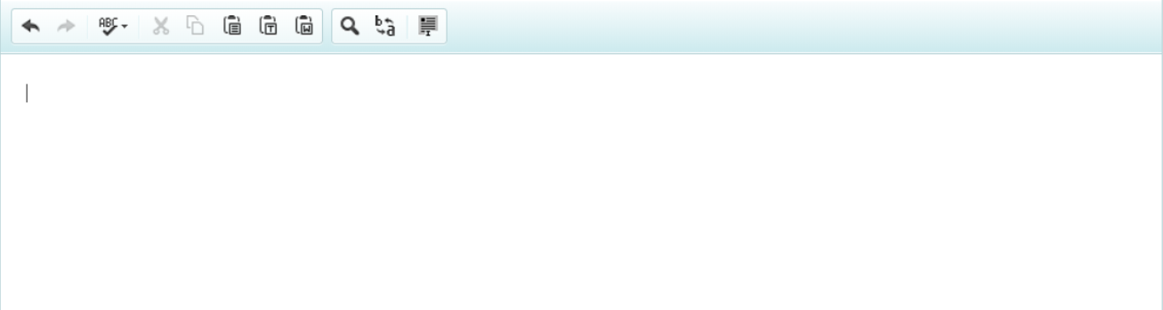
Here I am trying to group spellchecker and undo together and removed other items
toolbarGroups: [ // Configure Different elements present in Editor
        { name: 'clipboard', groups: ['undo', 'spellchecker'] },
        { name: 'editing', groups: ['find', 'selection'] }
      ]
This is how my editor looks like now.
Adding Custom Dropdown
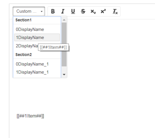
I am actually planning to add a custom dropdown to my editor which holds information about my merge tokens. So when I click on an item in my dropdown, we will be adding text equivalent to that item in my drop down
this.config = {
      uiColor: '#ffffff',
      on: {
        pluginsLoaded: function() {
          const editor = this,
            config = editor.config;

          editor.ui.addRichCombo('my-combo', {
            label: 'Custom Feilds',
            title: 'Custom Feilds',
            toolbar: 'basicstyles,0',
            panel: {
              css: [CKEDITOR.skin.getPath('editor')].concat(config.contentsCss),
              multiSelect: false,
              attributes: { 'aria-label': 'Custom Feilds' }
            },
            init: function() {
              this.startGroup('Section1');
              this.add(
                '[[##one##]]',"DisplayName_one"
              );
              this.add(
                '[[##two##]]',"DisplayName_two"
              );

              this.startGroup('Section2');
              this.add(
                '[[##3##]]',"DisplayName_3"
              );
              this.add(
                '[[##4##]]',"DisplayName_4"
              );
            },
            onClick: function(value) {
              editor.focus();
              editor.fire('saveSnapshot');

              editor.insertHtml(value);

              editor.fire('saveSnapshot');
            }
          });
        }
      },
      toolbarGroups: [
        { name: 'basicstyles', groups: ['basicstyles', 'cleanup'] }
      ],
      height: 500
    };
Here once all the plugin’s are loaded, we are defining configuration related to our dropdown.
I am trying to add a combo box with name ‘my-combo’ and giving title as ‘Custom Fields’.
toolbar: 'basicstyles,0',
This specifies that I am trying to add my custom element to basicstyles section defined in toolbarGroups
 panel: {
              css: [CKEDITOR.skin.getPath('editor')].concat(config.contentsCss),
              multiSelect: false,
              attributes: { 'aria-label': 'Custom Feilds' }
            },
Panel attribute is to set styles
this.startGroup('Section1');
              this.add(
                '[[##one##]]',"DisplayName_one"
              );
              this.add(
                '[[##two##]]',"DisplayName_two"
              );

              this.startGroup('Section2');
              this.add(
                '[[##3##]]',"DisplayName_3"
              );
              this.add(
                '[[##4##]]',"DisplayName_4"
              );
Here I am actually trying to add label and under that I wanted to add items.
Thanks,
Pavan